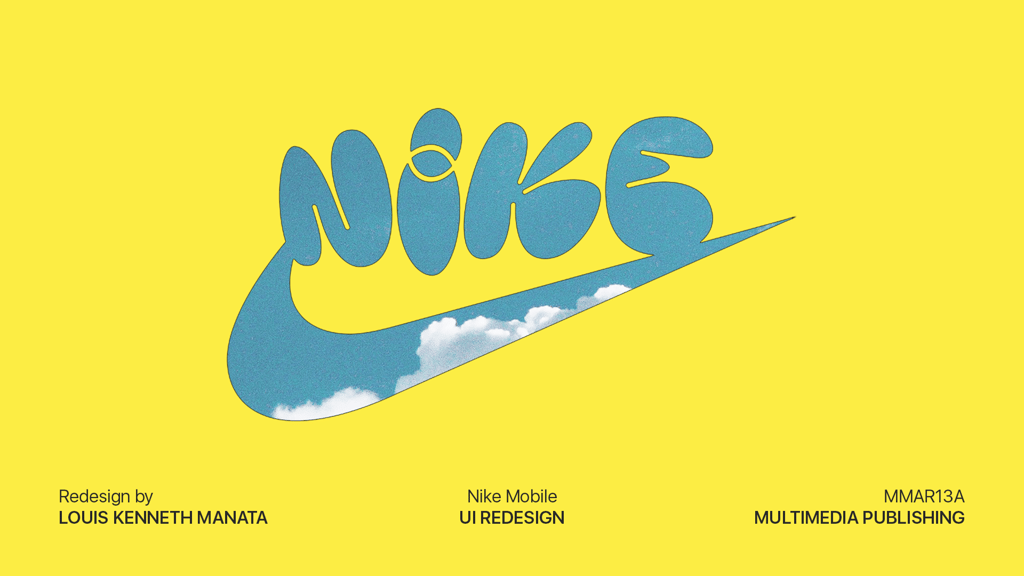
NIKE Mobile UI Redesign
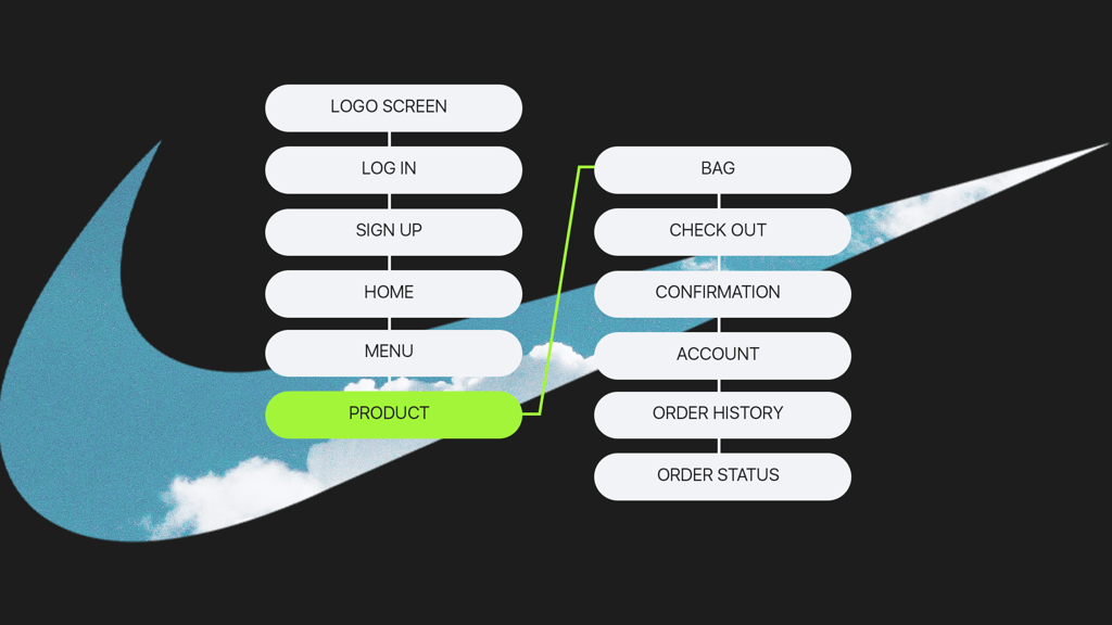
NIKE Mobile UI Redesign is a midterm project for the Multimedia Publishing course, where we were tasked to redesign the mobile shopping interface of an existing global brand. I chose Nike due to its strong brand identity and wide range of products, which made it an ideal subject for me to explore its layout, hierarchy, and visuals.
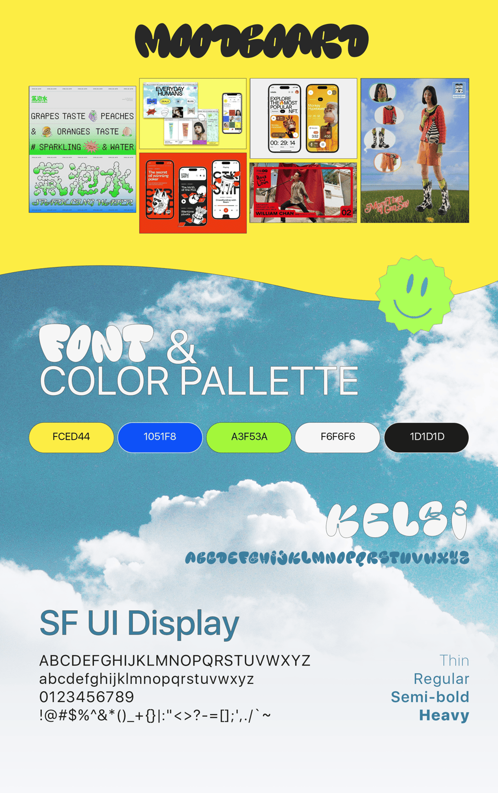
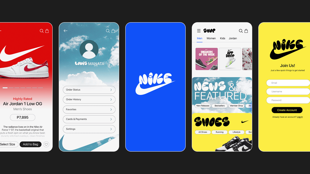
The original Nike mobile interface follows a clean and minimal design approach, as it uses a neutral color palette, structured layouts, and straightforward navigation to prioritize product visibility and functionality. While effective and polished, the interface leans toward a more serious and utilitarian shopping experience.
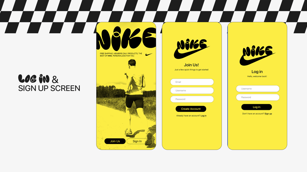
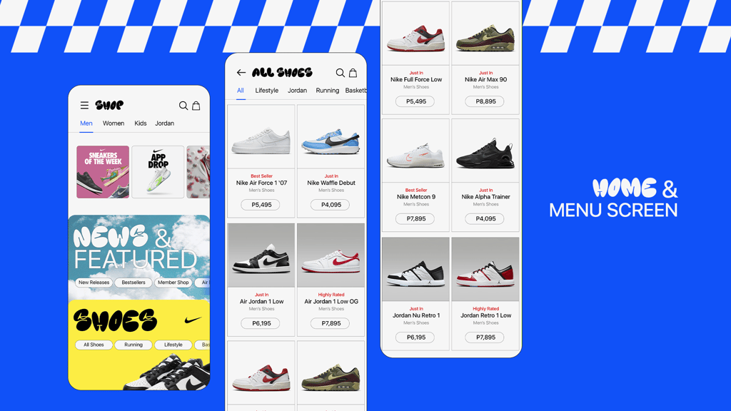
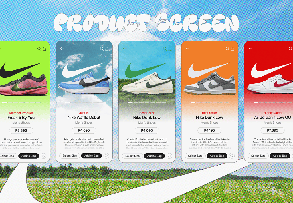
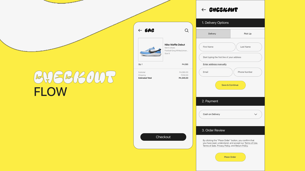
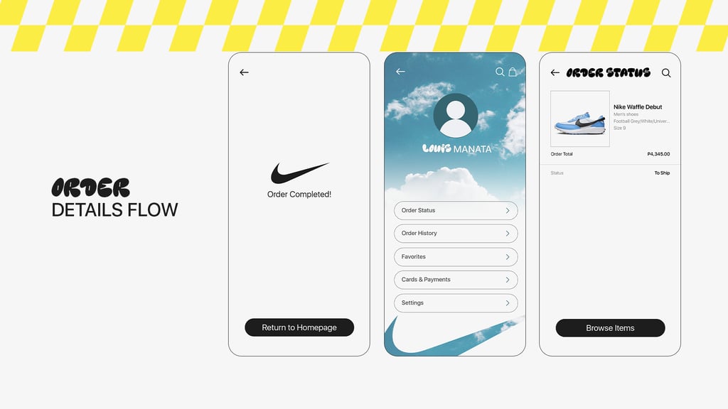
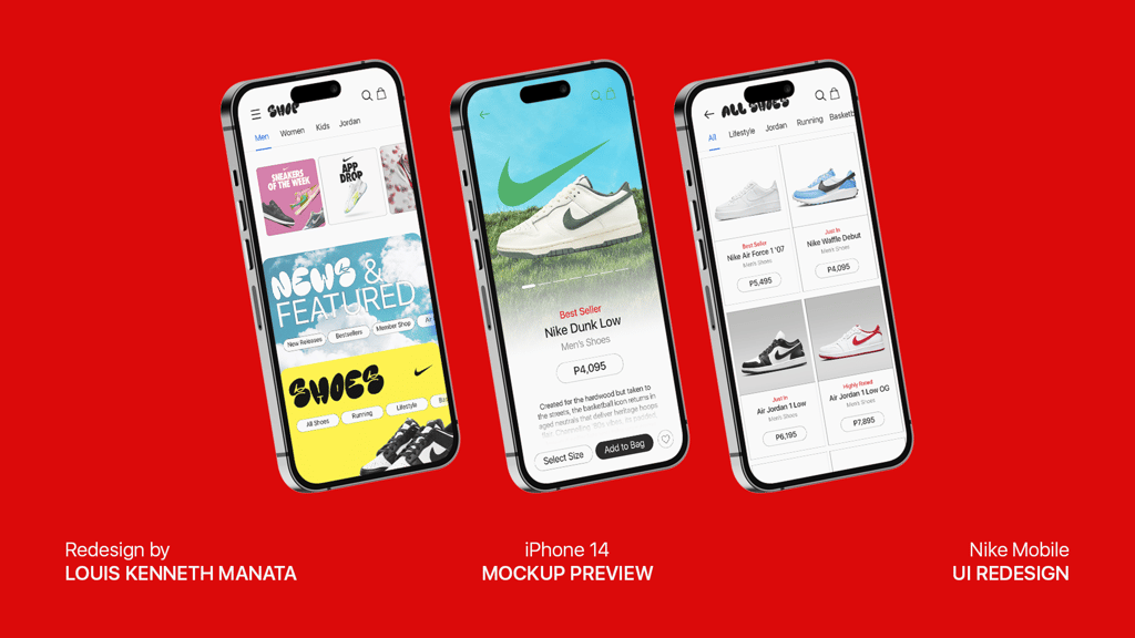
For my redesign, I curated a moodboard with a more pop-inspired direction, which focuses on vibrant colors, particularly cyan and bright yellow, to introduce a fresh and energetic visual tone. I envisioned the redesign to feel playful and dynamic, reflecting movement, youth culture, and the excitement often associated with sports and streetwear. This approach aimed to make browsing feel more engaging while still maintaining clarity and usability, resulting in a mobile interface that feels bold, lively, and visually inviting.
-
Roles: Graphic Designer
Tools: Adobe Photoshop
Type: UI Design
PROJECT CONTENTS
NIKE MOBILE UI - Moodboard and Redesign